A logo forms the foundation of your brand identity, which is why it’s so important to be deliberate and creative when it comes time to design a logo. In this ultimate guide, we’ll walk you through the comprehensive steps needed to design a logo, from gathering your initial inspiration to finalizing the last design. By the end, you’ll know how to design a logo that looks amazing on everything from your website to brochures to branded sunglasses!
Start with your company identity.
Even if your company is brand new, you probably have an idea of what you want your company identity to be. Start by noting the nuts and bolts of your company: what products and services you currently offer and hope to offer in the future. Then start exploring the less tangible aspects: What reputation does your company have, or that you would like to have? What are you known for? Is there anything about your identity that you’d like to change with the logo redesign? Who are you as a company? This will form the foundation of your logo.
Consider your current brand.
If you already have an established company, then you should also consider your current branding portfolio, including the colors, fonts, and other visual elements that you use. If you are trying to develop a new logo that fits within your current branding, that will provide a lot of upfront guidance and give you specific parameters to work within. If you are doing a larger rebrand of your entire company, then the logo should be developed in concert with this project instead of being worked on separately, to make sure that everything goes together harmoniously.
Evaluate your old logo.
If you already have a current logo that you want to change, do a deep dive into what you do and don’t like about your logo. Is it too similar to that of a competitor? Does it no longer reflect your brand identity? Does the icon feel outdated? Don’t only focus on the negatives, though: You should also make a note of what you do like about the logo, whether that’s the color, the shape, or the mood it evokes, so you can be sure to prioritize those elements during the redesign. Also think about whether you want to use the old logo as a jumping-off point or if you want to start completely from scratch with something brand new.
Figure out what mood you want to evoke.
Let’s talk a bit more about the mood you want to evoke with your logo. The emotional tone of your logo is very important for attracting your targeting demographic and communicating your company identity. A playful, humorous logo gives off completely different energy and attracts a different type of consumer than a logo that is calm and reliable. Make a list of emotional words that capture the feeling you want to evoke with your logo and hold onto them to use in the next couple of steps.
Experiment with different color options.
Color is very important for capturing the mood that you want to evoke with your logo, so browse some color palettes and flag the colors that speak to you. You will probably notice a trend in the colors you are drawn to, whether that’s calming cool tones or vibrant warm hues. Remember that you can also combine complementary colors (i.e., hues on the opposite of the color wheel) if you don’t want to stick to one color family.
You should also think about how many colors you want to use in your standard logo (one, two, three, or more). Keep in mind that no matter what you choose as your standard logo colors, you will also need alternative single color logos in both black and white for print and web purposes.
Explore different logo shapes.
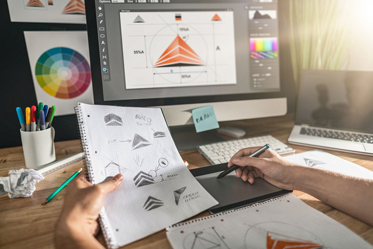
Another element that is very important for capturing mood is the shape of your logo. The same general design will feel different, depending on whether it’s in a circle, triangle, or a square. Play around with different logo shapes to see which ones feel right for your brand identity. It can also be helpful to come back to this step once you’re in the concept sketch stage. If you have a logo concept that feels close but not quite right yet, switching it to a slightly different shape may do the trick and pull everything together.
Decide who will design your logo.
When you’re ready to start mocking up concepts, there are a lot of options for getting a logo designed depending on your budget. If you already have an in-house designer, that’s a great option to take advantage of. Many marketing agencies also offer logo design services, so if you’re already working with an agency ask them about that.
Even if you don’t have a relationship with an agency, there are plenty of designers that you can work with on a freelance basis to get a professionally designed logo without hiring an entire agency. Your logo will form the basis of your brand identity, so you don’t want to skimp on it and end up with a low-quality logo.
Do a series of fast concept sketches.
Once you have selected a designer, give them all the brand discovery work you have done and ask them to mock up a selection of fast concept sketches. These sketches should offer a lot of variety while still reflecting the brand identity you want to project. Once the initial round is done, go over them and eliminate the ones that don’t resonate with you and keep the ones that do. Keep in mind that you may have to go through multiple rounds of concept sketches to really home in on your ideal logo, so be patient and ready to give several bouts of feedback.
Try out different types of logos.
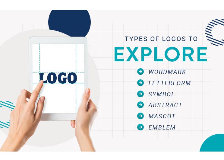
During the concept sketch phase, encourage your designer to try out different logo styles to see which one fits your brand the best. Some types of logos to explore include:
- Wordmark: the company name in a unique typeface; examples: Coca-Cola and FedEx
- Letterform: the company initials in a unique typeface: examples: CNN and HBO
- Symbol: a pictorial mark related to the company name or products; examples: Twitter and Apple
- Abstract: an abstract, unique pictorial mark unrelated to the company but visually identifiable; examples: Nike and Pepsi
- Mascot: a character associated with the brand; examples: the Michelin Man and the Pillsbury Dough Boy
- Emblem: a logo that combines text and images into one cohesive logo that resembles a badge or stamp; examples: the NFL and Harley Davidson
- Combo: a logo that puts text and images next to or on top of each other; examples: Taco Bell and Dove
Choose a font.
As you narrow down your logo concepts, you also need to start thinking about what typeface you want to use for your company name or initials. Unless your company has been around for decades and is already a very recognizable brand, then you will probably need some words to go with your logo to make it identifiable.
Try out different typefaces with your top logo concepts to get a feel for what fonts go best with which logo designs and see which combinations you like the most. Make sure to try many different placements since you’ll need a variety of logo dimensions for different situations, such as printing brochures or getting branded pens.
Get feedback on your concepts.
Once you’ve got some concepts you are happy with, it’s time to test them out. Show them to coworkers, friends, family, and customers to get feedback on them and identify which ones best capture your brand identity.
Once a consensus begins to form, you can use that feedback to make your final choice and give closing directions to your designer on finishing up the logo. Do keep in mind that you will probably get some conflicting feedback, especially if you ask a lot of people, so look for overall trends rather than trying to reconcile dozens of comments into one cohesive logo.
See what your competitors are doing.
During the feedback phase, you should also check out your competitors’ logos to make sure that you don’t choose a design or color scheme that is too close to existing logos. The whole point of a logo is having a unique, visually identifiable design that is immediately associated with your brand, not another company. If any of your designs are too close to existing logos, eliminate those from the pool of contenders to focus on the more unique logos.
Avoid cliche designs.
Just because you run a dog-walking business doesn’t necessarily mean that your logo needs to have a mascot of a dog in it. Indeed, it can be really hard to come up with a unique twist on logo cliches such as this one since it’s very likely that a lot of your competitors are probably already using obvious logos like the previous example. Don’t be afraid to explore slightly less obvious ideas, such as logos related to your name or location as opposed to your industry, that aren’t overdone.
Don’t get too complicated.
If you feel like you’re trying to cram too much into your logo, chances are that you probably are. This often happens during the feedback stage when one person thinks you need to incorporate the company tagline and another person wants a mascot and so on and so forth.
If you try to accommodate all of these requests, you’re going to end up with a crowded logo that’s more complicated than a “Where’s Waldo?” spread. Choose two to three elements max that you absolutely want included and eliminate the rest to keep the logo from becoming visually overwhelming.
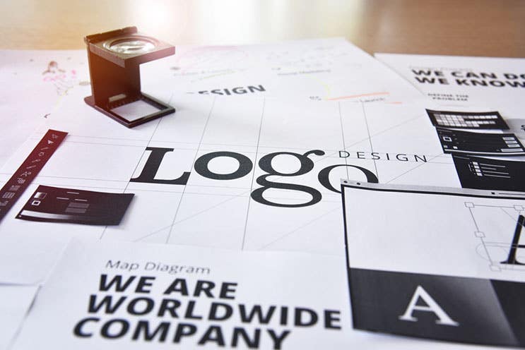
Go for timeless over trendy.
Every year, there’s a new round of logo trends, whether it’s choosing a cutesy doodle or making it look like a weathered, rustic stamp. It can be tempting to hop on the bandwagon and go with whatever design trend is hot at the moment, but try to resist the temptation to pick whatever is trending. In a year or two, the trend will be over, leaving your logo looking outdated even though it hasn’t even been that long. Instead, opt for a timeless design that will still look great for years to come. Releasing a new logo every couple of years will confuse customers and make it hard to establish a memorable brand identity, so it’s better to pick something that you can stick with for a while.
Remember the logo isn’t the end-all be-all.
Designing a logo can be very stressful; after all, a lot is riding on this one design. While a logo is a very important piece of the brand identity puzzle, remember that it isn’t the only one. You have your brand name, your color palette, your typeface, your photography, and many other elements at your disposal. This means that the logo doesn’t have to do everything! If the logo is getting overworked because you’re trying to turn it into a deluxe Swiss Army knife, try taking a step back and seeing how the other parts of your brand identity can support the logo and help do some of the work.
Wondering which of your logos would look best on promotional products? At iPromo, our customer service team will work with you to generate quotes and get the design proofs approved so you know that you’re getting a product that you will love.
Image Credits
Puckpao/Shutterstock.com
sheff/Shutterstock.com
Rido/Shutterstock.com
TierneyMJ/Shutterstock.com
Al Desain/Shutterstock.com
PureSolution/Shutterstock.com
REDPIXEL.PL/Shutterstock.com

